C:\1980S\EXCELFOR.TXT
1985
Excel for Macintosh: Making the Model Visible
The first Excel combined a graphical worksheet, calculations, and charts on the Macintosh before it reached Windows.
A spreadsheet can hide a program inside a page that looks ready for a meeting. The labels are reassuring. The numbers line up. Then one assumption changes and a different profit appears at the bottom, apparently of its own accord.
The first Excel made that familiar spreadsheet idea part of the Macintosh’s graphical working environment. Microsoft announced shipment to retail stores on September 30, 1985. The original platform was the Mac; Excel’s Windows history began later. This is an easy detail to lose when a product becomes so strongly associated with another operating system.1
The interesting development wasn’t the invention of the spreadsheet, which had already proved its value. It was a combination of calculation, visible formatting, business graphics, and the interactions available on a graphical desktop. A model could become easier to inspect and easier to present. Those improvements aren’t quite the same thing, as the eventual reviewer of the budget would discover.
A Macintosh application with business ambitions
Microsoft’s historical chronology describes Excel as combining a spreadsheet with business graphics and an on-sheet database. Its September 30 entry records shipment to retail stores, giving this article a concrete release milestone rather than treating development or announcement as availability.1
The Macintosh already offered a graphical environment and mouse interaction. Excel could use that environment to make cells, ranges, and presentation choices concrete objects of attention. Selecting an area on a displayed worksheet gives the user an immediate relationship between an action and the affected cells.
That doesn’t remove the need to understand formulas. It makes ordinary operations less dependent on remembering a sequence of commands. A selection can show the range that will be copied or formatted. A graph can expose a relationship that a column of figures makes harder to see.
The product also entered an established spreadsheet market. VisiCalc and Lotus 1-2-3 had already shown that recalculating a business model was a compelling reason to use a personal computer. Excel’s position was a particular graphical implementation of that valuable idea, with room to make document presentation part of the regular working process.
Modern Excel shouldn’t be projected into this version. A contemporary Excel file, VBA program, or ribbon interface isn’t evidence of what a 1985 Mac user saw. This article explains the early product’s broad combination through a small original worksheet rather than supplying a catalog of later capabilities.
Build a model small enough to distrust
Suppose we are planning an invented workshop. The model has a ticket price, a variable cost per attendee, and a fixed venue charge. Write those assumptions in clearly labeled cells:
| Cell | Meaning | Value or formula |
|---|---|---|
| B1 | Ticket price | 25 |
| B2 | Variable cost per attendee | 8 |
| B3 | Fixed venue cost | 600 |
| A6 | Attendance | 40 |
| B6 | Revenue | =A6*$B$1 |
| C6 | Total cost | =A6*$B$2+$B$3 |
| D6 | Profit | =B6-C6 |
The row calculates revenue of 1,000, costs of 920, and profit of 80. These figures are invented. The formula notation illustrates the conventional cell-reference model; it isn’t a transcript executed on the original software.
Notice the structure of the calculation. Attendance affects both revenue and variable cost. The fixed venue cost remains the same in this simplified model. The profit cell depends on two calculated results rather than duplicating all their arithmetic. The worksheet describes relationships as well as values.
That matters when an assumption changes. If ticket price becomes 28, the revenue formula should use the new value automatically. Copying a result as a plain number would lose the relationship. A worksheet full of manually pasted answers can resemble a model while behaving more like an illustrated receipt.
Keep the assumptions distinct from the results. A reader can then ask where the ticket price came from without also reverse-engineering the revenue formula. The document becomes easier to audit because its important choices have addresses and labels.
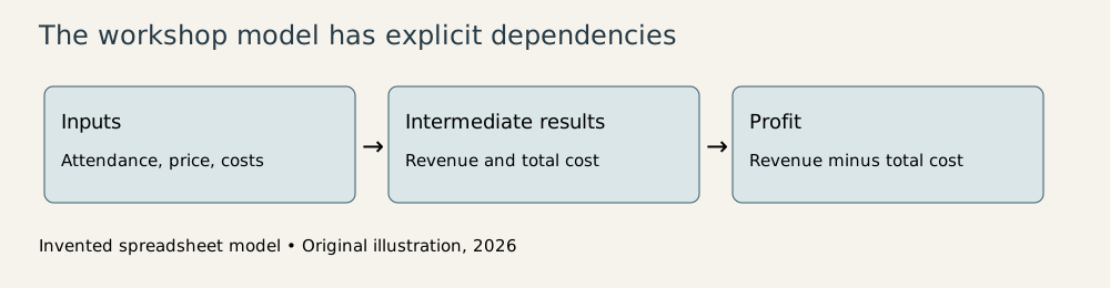
Original explanatory diagram, 2026; invented workshop model, not a screenshot of Excel 1.0.
Copying is a semantic operation
Now add attendance scenarios in rows 7 and 8: 60 and 80 people. Copy the revenue, cost, and profit formulas down. A relative reference such as A6 changes with the formula’s position; copied one row downward, it becomes A7. An absolute reference such as $B$1 keeps pointing to the ticket-price assumption.
This mix is the clever part. The formula’s local input moves with its row, while shared assumptions stay anchored. One expression becomes a family of calculations without forcing the author to retype it carefully several times.
For 60 attendees, revenue is 1,500. Variable cost is 480; including the venue charge gives total cost of 1,080. Profit is 420. At 80 attendees, revenue reaches 2,000, total cost reaches 1,240, and profit reaches 760.
| Attendance | Revenue | Total cost | Profit |
|---|---|---|---|
| 40 | 1,000 | 920 | 80 |
| 60 | 1,500 | 1,080 | 420 |
| 80 | 2,000 | 1,240 | 760 |
If the cost formula accidentally used B3 rather than $B$3, copying it down could move the fixed-cost reference into a different cell. The resulting figures might still look plausible. Spreadsheet errors frequently prefer to dress respectably.
A graphical selection helps show which cells are being copied, but the references still require thought. The interface makes the operation visible; the author’s notation determines whether it preserves the intended meaning.
The same reasoning extends across columns. A formula may need a fixed row and a moving column, or a moving row and a fixed column. Understanding what should remain constant is more dependable than memorizing dollar signs as decorative punctuation.
One model, several kinds of evidence
A chart of attendance against profit makes the relationship visible. In this simplified model the line rises steadily because each extra attendee contributes $25 in revenue and $8 in variable cost. The difference, $17, pays toward the fixed cost and then becomes profit.
The break-even attendance is
Because our model counts whole attendees, 36 paying attendees are needed to reach a nonnegative result. At 35 the model loses $5; at 36 it gains $12. These neighboring cases are useful checks against trusting only a rounded display.
A chart can show the crossing between loss and profit. It also encourages a dangerous visual inference: that the straight line continues indefinitely. The model assumes the venue can hold all the attendees and that no extra staffing or equipment charge appears. At a capacity limit or a new cost threshold, the relationship changes.
The graph faithfully displays the worksheet’s assumptions. It doesn’t validate them. A smooth line is an excellent way to communicate a model and an equally good way to make an unjustified assumption look settled.
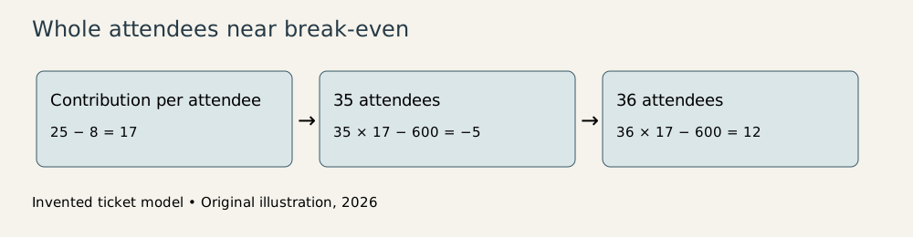
Original explanatory illustration, 2026; calculated from the invented inputs in the article.
An on-sheet database belongs to a different task: storing and selecting lists. A business might have rows of customers or transactions alongside its numerical work. The original product’s inclusion of that capability reflects a practical desire to keep common business operations within one environment. It shouldn’t be read as a claim that a worksheet offered every guarantee of a dedicated relational database.1
The typography of confidence
Formatting helps a reader distinguish assumptions, headings, money, and results. A currency display gives a number its intended unit. A visible total makes a worksheet navigable. These are useful improvements because a model that nobody can read isn’t especially accountable.
Formatting can also conceal uncertainty. Displaying a value to two decimal places doesn’t guarantee that its inputs deserve that precision. Rounding a result on screen doesn’t necessarily change the stored value used by later calculations. A displayed 35 may therefore represent something materially different from an exact integer count of 35.
A responsible worksheet communicates both its arithmetic and its interpretation. Label the units. State whether attendance is a forecast or a confirmed count. Explain that the simplified cost model ignores capacity thresholds. The reader should be able to distinguish a calculation from the assumption it is faithfully calculating.
The graphical desktop made those explanations easier to arrange within a presentable document. That was a meaningful business capability. Decisions often happen in shared documents, and a calculation has to survive the transition from the author’s private understanding to another person’s review.
A friendlier surface still contains a program
Excel for Macintosh belongs in the decade’s history because it brought a strong business tool into a developing graphical environment. Its original combination of calculation, charts, and worksheet data handling made the computer useful for a coherent set of everyday tasks.1
The enduring tension is between ease of use and ease of verification. Direct interaction and readable formatting can help people build and inspect a model. They can also help an unexamined model travel farther before anyone notices its assumptions.
I like the spreadsheet best when it exposes its workings. Our workshop model is small, labeled, and checkable with a few substitutions. A larger model needs the same virtues, even if it expresses them across more cells. A graphical interface can make that care convenient. It remains the author’s job to make it visible.
Footnotes
-
Microsoft, The History of Microsoft—1985, September 30 entry: Macintosh retail shipment, spreadsheet, business graphics, and on-sheet database. ↩ ↩2 ↩3 ↩4