C:\2010S\ANDROID4.TXT
2011
Android 4.0: One Platform, Several Shapes
Ice Cream Sandwich unified Android's phone and tablet direction while making application authors confront the space their interfaces actually needed.
A form can be perfectly legible on a phone and strangely wasteful on a tablet. Give it two columns everywhere and the phone becomes a negotiation between labels, fields, and the keyboard. Give it one column everywhere and the tablet politely displays the negotiation at greater length.
Android 4.0, Ice Cream Sandwich, arrived with an ambition to bring phone and tablet software into a unified platform. The developer announcement is dated October 18, 2011 and explicitly encouraged testing before devices reached stores. That is the milestone used here, rather than treating an SDK announcement as the shipping date of every handset.1
The period’s interesting software problem was more specific than whether Android looked newer. It needed to support related applications across machines with different amounts of usable space. A single toolkit could express that family resemblance. It couldn’t decide where an application’s layout should change.
That last decision still belonged to the developer, which was inconvenient for anyone hoping the word “unified” meant the design work was finished.
Unification had visible consequences
Google’s announcement listed a unified UI toolkit, richer sharing, new layout and graphics capabilities, improved accessibility APIs, and enterprise additions. The contemporary development tools were SDK Tools r14 and the Eclipse ADT plugin 14.0.1
This is a useful period boundary. Android Studio, Kotlin-oriented application development, and later declarative UI systems aren’t part of this release’s working environment. Reading a modern Android tutorial without checking its date can attach a decade of later machinery to a 2011 phone.
The version-specific platform overview describes visible navigation through Back, Home, and Recent Apps, contextual actions in the Action Bar, resizable widgets, and new data-usage controls. Recent Apps used thumbnails to help users return to previous tasks.2
Those features concern continuity across tasks and access to common actions. They do not imply that every application contains the same navigation structure or that a larger screen merely gets larger controls.
A shared platform can supply conventions. The application must supply a coherent task. A data-entry form, a game, and a map can follow some of the same conventions while using their working areas very differently.
Count useful space rather than pixels
Screen resolution describes the number of physical pixels. Pixel density describes how tightly they are packed. Neither alone tells an application how much room it has for a comfortably sized interface.
Dianne Hackborn’s July 27, 2011 developer article explains Android’s density-independent pixel, or dp, and the numeric screen-size selectors introduced in Android 3.2. Those tools preceded 4.0; they are part of the inherited mechanism, not inventions attributed to Ice Cream Sandwich.3
For an original exercise, invent two devices. The first has an available 720-by-1,200-pixel region at a declared density of 320 dots per inch. The second has 800 by 1,280 pixels at 160 dpi. We deliberately treat these as available app areas, avoiding deductions for system bars.
Use the teaching conversion
The first device supplies 360 by 600 dp. The second supplies 800 by 1,280 dp. Their raw pixel widths differ by only 80, but their logical widths differ by 440 dp.
| Invented device | Pixel area | Declared density | Logical area |
|---|---|---|---|
| Compact | 720 × 1,200 | 320 dpi | 360 × 600 dp |
| Roomy | 800 × 1,280 | 160 dpi | 800 × 1,280 dp |
These aren’t specifications for any historical handset. They show why choosing a layout from raw resolution can produce the wrong result. A high-resolution small display can still need the compact arrangement.
The density value is a platform configuration, not a promise of perfectly calibrated physical inches. This exercise concerns Android’s layout coordinate model. It doesn’t use a ruler to validate a real panel.
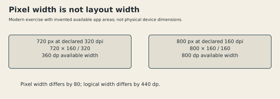
Original illustration, 2026. Invented available app areas and declared densities. It compares logical widths, not the physical size of period Android devices.
Give the form an explicit threshold
Now design an invented field-inspection application. Its compact form displays an observation’s fields in sequence. Its expanded form keeps a location summary beside those fields, useful when checking which site the observation belongs to.
Suppose the summary requires 220 dp, the field column requires 340 dp, the gap needs 24 dp, and outside margins total 32 dp. The expanded layout needs:
Choosing a 620-dp threshold leaves a small allowance. Choosing 600 because it sounds like a tablet size would contradict our own requirements. Platform examples are useful defaults; they don’t overrule the application arithmetic.
Android’s numeric resource qualifiers express minimum available widths. A teaching resource arrangement could be:
res/layout/inspection.xml
res/layout-w620dp/inspection.xml
The first supplies a default; the second is eligible when the current available width reaches 620 dp. This naming follows the period selector mechanism, but the filename, threshold, and proposed form are original.3
The application isn’t asking whether the machine has a familiar marketing label. It is asking whether this arrangement fits. That is a more dependable relationship when manufacturers invent another screen size.
There is still no guarantee of good results. The text may be longer in another language. The user may request larger type. An input method may alter the useful region. A numerical threshold supplies a testable rule, not a substitute for testing the interface.
Rotation changes a different number
The same July account distinguishes current available width from smallest width across orientations. The former can change on rotation; the latter expresses a more stable size characteristic.3
Give an invented medium device an available 600-by-960-dp area. In portrait, its width is 600. In landscape, its width is 960. Its smallest width remains 600 in this simplified model.
A rule based on current width and our 620-dp threshold would use the compact form in portrait and the expanded form in landscape. A rule requiring a smallest width of 620 would use the compact form in both orientations.
Both rules can be coherent. They answer different questions. The first says the expanded arrangement may appear whenever it fits now. The second reserves that arrangement for a device that can sustain the minimum width through rotation.
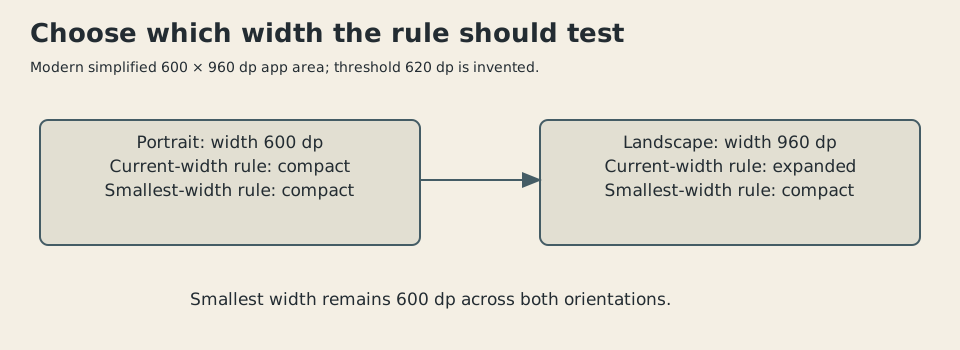
Original diagram, 2026. Invented 600-by-960-dp available area and 620-dp threshold. System insets and input-method effects are omitted.
For our inspection application, switching layouts is acceptable if the observation remains selected and entered values remain intact. If changing orientation discards a half-written note, the resource choice has succeeded while the application has failed.
That is a separate engineering responsibility: keep the task’s data independent enough from its current presentation to survive presentation changes. A more capable layout system creates more occasions to need that separation.
A platform release doesn’t instantly update a fleet
The October announcement encouraged existing developers to test their applications with the new platform before hardware availability. That distinction matters in an ecosystem with older devices and different software versions.1
A developer adopting a newer layout feature still had to consider the minimum supported platform and fallback behavior. A user holding an older phone didn’t gain a new API because an announcement used a confident adjective.
Likewise, one application package can contain alternate resources without becoming several unrelated products. The layouts should share task meaning and data behavior even when their views differ. Otherwise the user has received a family of applications that happen to use the same icon.
The main benefit of the shared toolkit is a common vocabulary for those variants. It makes the alternatives describable. It doesn’t erase the costs of maintaining them.
This is also why the historical argument should stay narrower than “Android solved fragmentation.” Screen adaptation is one part of platform variation. Device capabilities, release versions, manufacturer software, and application assumptions remain separate dimensions.
The user gains a view of hidden work
Android 4.0’s data controls offered a different kind of visibility. The version overview describes usage by network and application, optional warning levels or limits, and controls for individual applications’ background data.2
For a separate original example, imagine a monthly allowance of 1,500 megabytes. Foreground map use consumes 420 MB, visible media use 530 MB, and background synchronization 310 MB. The modeled total is 1,260 MB, leaving 240 MB.
A user who remembers only the visible activities may expect 550 MB remaining: 1,500 minus 950. Including background synchronization changes that expectation by 310 MB. The arithmetic makes the value of attribution plain.
These quantities are invented and use decimal megabytes throughout. They aren’t measurements of Android’s accounting or a carrier’s billing. The point is that consumption can occur outside the task currently on screen, and a useful operating system can make it inspectable.
The screen-size work and the data controls share an interesting temperament: replace a vague category with a quantity that can inform a decision. The application needs a certain width. The user has a certain amount of network usage. Neither question is answered by knowing that the phone is modern.
A common platform still needs honest boundaries
Ice Cream Sandwich is consequential as a unifying release because it connected phone and tablet directions in a shared user and developer environment. Its inherited screen tools let applications describe concrete alternatives rather than hoping one arrangement would suit every device.
Later Android development would add other APIs, languages, tools, and interface patterns. Those changes shouldn’t be credited to 4.0 merely because today’s software retains the Android name.
What I find useful about the 2011 milestone is its practicality. A common platform can standardize the ingredients, but an application still needs to know its minimum working space and preserve the user’s task when that space changes.
A screen with more pixels may draw the same cramped form more sharply. Better software starts by noticing that those are different improvements.
Sources
Footnotes
-
Xavier Ducrohet, “Android 4.0 Platform and Updated SDK Tools”, October 18, 2011. Developer announcement, unified toolkit, SDK/ADT versions, and testing-before-devices boundary. ↩ ↩2 ↩3
-
Google, “Ice Cream Sandwich: Android 4.0”, version-specific platform overview. Read navigation, widgets, and data-control sections. Current site navigation doesn’t change the historical version named by the document. ↩ ↩2
-
Dianne Hackborn, “New Tools For Managing Screen Sizes”, July 27, 2011. Android 3.2 predecessor mechanisms: dp, width/smallest-width qualifiers, defaults, and matching. Inspection-form thresholds and devices are original teaching examples, checked outside Android. ↩ ↩2 ↩3